As part of 1xRUN’s 2020 Bicycle Day Print Suite, we are excited to make history with the first collaborative editions from poster art legends Shepard Fairey and John Van Hamersveld! In four distinct colorways, Psychedelic Andre is equal parts influence from the two artists: Hamersveld’s classic Jimi Hendrix concert poster is blended with Fairey’s ubiquitous Andre the Giant Obey illustration.
You may recognize Van Hamersveld’s work on over 300 album covers, including art for the Beatles, The Beach Boys, Jefferson Airplane, Jimi Hendrix, and the Rolling Stones. Known for a wide array of styles and a sophisticated use of color, the art of John Van Hamersveld helped define the gig poster movement of the late 1960s, and one image in particular, Pinnacle Hendrix, had a profound influence on Shepard Fairey in his early development as an artist.
To mark this occasion, we caught up with Van Hamersveld and Fairey to trace the lineage of Hamersveld’s Pinnacle Hendrix poster, its impression on Fairey, and the relationship that the two artists developed because of it. Read on to find out more about these historic editions…

1xRUN: Let’s start with talking about this imagery. John, tell us about when you first created this Hendrix image. Anything immediate you want to highlight?
John Van Hamersveld: I made this image in 1967, and then the poster came out in 1968. One day I sat down and started this drawing out of my style. I had been an art director at Capitol Records, and I hadn’t been drawing very much. It was a whole new state I was in. But it was an opportunity to test my drawing and put it into a poster, and have it published. It all came out great. It was a fantastic show. There were ads everywhere and people loved the poster. It just started to become a piece of history right away, much like The Endless Summer poster.

1x: Was there much art direction given, or were you left to your own devices?
Van Hamersveld: No. I actually found out much later, just the other day in fact, from my partner Mark Chase, who was at Pinnacle with me. (Ed. Note: Pinnacle was Van Hamersveld’s production company for concerts around Los Angeles.) He had met with the manager, and he said they didn’t like the poster. They wanted to have all three members of the band. You always have that going on. But somehow it went through the politics, went to the printer’s, and was published.
1x: That original design, was that for promotional flyers and handbills, or a poster that people could buy at the show?
Van Hamersveld: It was a promotional poster first. There were around 2,400 of them made. They were put in stores and on telephone poles as a communication. People could buy them. We would line the windows with them so people couldn’t see in the windows when they came to the shows, and when they would leave, people would tear them all off the walls and off the bandstand.
I had a relationship with Martin Geisler of Personality Posters, in New York for the distribution of the Endless Summer posters. There was an unbelievable amount of posters sold through college campuses, bookstores for students’ dorms and all of that. Then to the army, the PX’s (Post Exchange/military stores), so it went all the way to Vietnam. There were surfers there. So I meet Geisler at the studio and he sits down with me and says, “What’s going on?”. I show him these posters and he says, “Great, I’ll buy those from you.” So I printed 3,500 of each design, put them on skids, and sent them back to New York. Then they were sold there throughout the world. So I had a much more connected world of distribution than San Francisco. But then, Chet Helms opened up a ballroom in Colorado, and he had stores there selling the San Francisco posters. They had some distribution, but what San Francisco really had was media looking at them. Writing everything they did. Every riot. Every poster. Every singer. They had such attention in the media. That was their distribution.
1x: So you went to the show too?
Van Hamersveld: I was a partner in the show. There were three of us at Pinnacle. Marc Chase, Sepp Donahower, and myself. Then there was the Bogdanovich Family, who owned Starkist Tuna, who put the money up for the shows.
1x: Interesting. That tuna money.
Fairey: Amazing.

1x: What was your technique at the time? What materials were you using?
Van Hamersveld: Well they had these rapidograph pens, then they had these Pentel pens, which were a bit looser. I liked that because it was much more like a crayon in making up the drawing. The rapidographs were for more detailed-like drawing, for mechanical diagrams.
1x: How was that original printing done?
Van Hamersveld: They had a two-color press that I was using at Capitol on Fairfax, so I took it over there, and the guys fell in love with my complicated mechanicals. We would run two colors: one sheet through, then turn it around and run two more colors down. It was almost like silkscreening at the time. The tuning board was people turning screws or running along the side of it trying to get the ink to flow. There was just one button for color up or color down. You want it brighter, you just press harder. You want it lighter, you just don’t push it.

(R) Hendrix @ Shrine Auditorium. Photo by Chuck Boyd.

1x: Shepard, what was your first interaction with John’s image? What did you think the first time you saw it?
Shepard Fairey: It’s fascinating because it’s one of those images that I’ve seen… I became a fan of Hendrix after I exited my punk rock orthodoxy phase. Later in high school I was really getting into a lot of classic rock, and Hendrix was one of my favorites. I liked a lot of the imagery around Hendrix. I don’t really remember where I first saw the Pinnacle image because I was just collecting as much literature and ephemera of this culture as I could. I know that I had a L’Imagerie catalog, which was like a poster publisher out of San Francisco, that had this image in it.
I was getting really into a lot of the other psychedelic posters by Victor Moscoso, Rick Griffin, and Stanley Mouse, but I assumed that John was part of that San Francisco grouping. What he did with this, and a couple of other images of his, felt very much in step with that movement. I ended up gravitating towards John’s image because it had that nod to psychedelia, without going so overboard in the baroque detail, that it remained iconic. When you look at my work there’s more of an influence in that direction, where there is a recognizable style, but there’s an iconic quality that is not too difficult to read what the communication is from the typography or from the portrait.

In fact, there’s a good reason for that: the reason was that this Hendrix image itself — along with a few other influences, like Barbara Kruger and Russian Constructivism — was a huge influence in how I was going to make work that had the ability to cut through the clutter of what’s on the street and still have a recognizable style. This image was incredibly influential because it captured the essence of Hendrix while still having strength in each abstract mark that makes up the face, the hair, the sort of frilly part below him (which, at the time, I thought was an homage to Beethoven, but then realized was actually a nod to Eric Clapton). All of that was really an inspiration for me.
It also turned me on to what I thought was really great about the styles of Art Deco and Art Nouveau, because there are nods to both here. This image for me, it drew me in, and really made me dig deeper into all the stuff going on within those movements. It was the first image that I first sort of knocked off and did a mash-up of with Andre. It was 1992, and I had only made variations of the original Andre face and sticker.


I think that one of the reasons I was so attracted to the psychedelic stuff was that the color combinations and patterns were so powerful. When I was just making variations of the Andre on the different backgrounds, I was looking at a lot of psychedelic work, but John’s piece really inspired me to make something that was a deviation from just playing it safe with the original Andre image. So John’s Pinnacle Hendrix was sort of a gateway to the evolution of my entire Andre The Giant project. I can’t really understate the importance of this image for me.
1x: John, when was the first time that you saw Shepard’s reclaiming of your Hendrix iconography?
Van Hamersveld: In this poster scene, there was this place called the Psychedelic Solution, and Jacaeber Kastor would have these shows. I had a show there, and we had a relationship because he was from San Francisco. So he had set up a gallery in New York on 8th street, or was it on 13th or 11th street?
Fairey: I think the show that you came to was at the Alleged Gallery on Ludlow Street. I wasn’t there when you and Jacaeber came through, but the co-curator was Carlo McCormick, who was good friends with Jacaeber and—

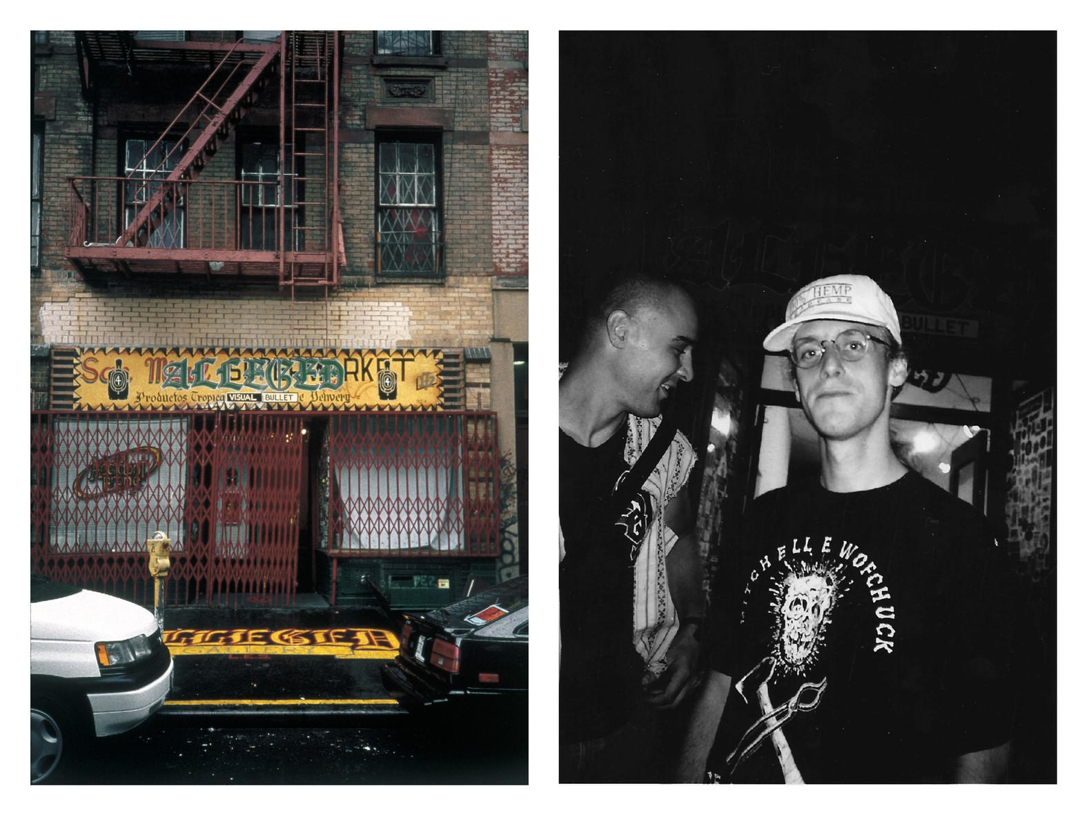
Van Hamersveld: Right! I remember. He was a writer/critic.
Fairey: Yes. Carlo worked at Paper Magazine. He wrote the foreword for Robert Williams’ book, and is basically a cultural aficionado. He was the one who brought you and Jacaeber over to the show at Alleged, where my Andre-Hendrix mashup was displayed. At that time, I had only made about five different images, and all of them were in that show. That was in 1994. I had originally made that image in 1992. It was very early on that John saw my work. Juxtapoz Magazine was brand new at the time, and there was a small blurb about John seeing it and giving it sort of — they were a little bit enigmatic about it — but they gave it a nod of approval. It wasn’t any more explicit than that. But to me it was just such a relief that you weren’t mad about it. So, thank you, John.
Van Hamersveld: You’re very welcome. I was a teacher at CalArts for seven years, so I was well aware of influencing and teaching people how to be artists, deal with design, typography and all of it. I was a little more philosophical about it. Always interested in the discovery and people discovering, and how that expands and explodes and becomes their thing. Much the way my work works.

Fairey: The way I would describe it is: you should be flattered because I was emulating your work. I was out of art school at that point. I had recently graduated and was developing my different set of skills. I called it a “solo apprenticeship.” I basically emulated everything I thought was good, and I learned how to achieve that visual language. Eventually, it all sort of synthesized together into my own thing. But that was in the early, early phase, when my work was much more derivative. Me doing that piece, and you being okay with it––I got to have a positive association with an important part of my evolution. That’s something that I’m always going to be thankful for.
Van Hamersveld: Yeah, and I was a living artist. When I designed the Hendrix head, Aubrey Beardsley was my sort of influence, along with Japanese woodblock cuts from The Floating World. They were always getting high and they all kinda went together.


“These are the Mouse drawings in an emotional world of turmoil in 1969, New York City. Moving architecture of floors, walls and in a reflective state as a changing world. These drawings came after 3 months in hash dens in London.” – JVH
Fairey: I learned a lot of my color theory from the psychedelic rock posters. Prior to that, I treated most of my work like punk rock poster making, where everything is black and white and then you add color.
Van Hamersveld: Very restrained.
Fairey: Very restrained. The cool thing about your pieces is how the use of color is very sophisticated for how loud and attention grabbing they are. It made me realize, when you’ve got simultaneous contrast but chromatic difference, that’s a whole different world to play with, instead of just looking at things like grayscale with spot color added. It’s a different sensibility. So that was really important to my evolution. Even though I was never a psychedelic drug user, it gave me a sense of how to achieve that hypnotic vibration with color. That was obviously why psychedelic drugs and that kind of color use were associated with each other.
Van Hamersveld: Yeah, but that is a naive world of color use in the San Francisco scene. I come from Art Center College of Design, in the sort of Bauhaus training about color, shape, form, and line. I’ve learned how to make letter forms, juxtapose all different kinds of colors together. So when the Endless Summer is made, it’s very academic. It has the analogous color scheme. I knew how all three of those colors would go together.

(Bottom) one of Fairey’s recent waves.
From photography being a line resolution and making contemporary high resolution of that, then I actually hand-lettered the lettering, which is still good some 50 odd years later. But I had all those skills built into my academic work at that time, working on surfing magazines. So when I get to Chouinard [now known as California Institute of Arts], I loosened up and realize that there’s much more flexibility within the Bauhaus, I don’t have to deal with it. So I was attracted to the San Francisco scene because they were all naive, but they were spectacular color combinations that I had never seen before.
Fairey: One of the strengths of the Hendrix — I think — is the structure of the typography, and how the border allows the sort of psychedelic, electric, and ethereal aspects of the pointillism to fit and create this tension between organic and chaotic. But very refined and controlled and structured. A lot of the psychedelic posters at the time just abandoned traditional structure altogether.
Van Hamersveld: Altogether. Sweeping. Rolling. Turning.
Fairey: In a way I can understand — even though I’m not an acid taker, many of my friends do, I hang out with that crowd — why that made sense. I can see it. It’s almost as the viewer you have to let yourself become enmeshed into the chaos of the psychedelic posters. My preference has always been more what you did with the Hendrix.
Van Hamersveld: It’s organic, a moving form, which is within the drug, as you see the bending and swirling of all these different images together in that view. You have the high contrast. You have the typography reading in negative/positive, but in this flowing structure. So, to the viewer, it was like having the sense that you’ve been there, and they’re going to have this show. Look at this show and look at what they are showing us. That was the San Francisco scene.
Then with mine, each poster I did was an experiment. The secessionist typography and this live, crazy looking face with electric hair. The juxtaposition was so great. It was really taking the tradition of typography and its history, and then combining that with something that was brand new, odd and strange. That’s the way that kind of worked.

The typography is really kind of an influence from the secessionists, which is a little earlier than Art Nouveau. (Or maybe later? I’m not sure). But the head, the portrait itself is being at Capitol Records. Seeing all the album covers coming in, they were actually working on an album for Jimi and his bass player at the time (pre-Experience), and I thought, “look at that hair!” That kind of bouffant, sort of strange hair that he has, that The Cream has in their photographs. Why don’t I just make that electric? Rather than a straight line, it became wiggly, so it felt like a jolt of energy. It really seemed like it stood on its own. Then if I could just put that into a square with silver in the background, then orange into the letter forms, and use the blue for the border, it would have a much more royal quality to it.

The event with Jimi Hendrix and Blue Cheer at the Shrine Auditorium in 1968 was the first time that they had ever let a band play there. Politically, it was a whole new dimension for us and for the USC students. When it starts out, they let all these elegant membership people into the auditorium, and then the ticket buyers who are there to see Hendrix. The other two bands, The Electric Flag and Blue Cheer, were just these knockout bands that just leveled everything in sight in terms of sound. Then we had a light show behind that, which had some disturbing images. Some of the board members got upset and they left. Towards the end of it, Hendrix is blasting away and everything, he comes to the end of his solo and picks up the guitar and throws it into the screen of the light show. That sort of ended it. It was one of those amazing points in time in LA. Way above everything you ever saw on the Sunset Strip or in the Hollywood rock scene.

Fairey: So John, at that point had you already shot the photo for the Blue Cheer cover, or did that come later?
Van Hamersveld: I think that was around the same time. I think I did that in December, so it was before. Allan “Gut” Terk (manager of Blue Cheer) came by the studio after the band played. We hung out with them in San Francisco for a little bit, and then he decided I should take a picture of them. When they were down there at my studio, I was into photography and had a dark room built in. So I took this picture, and then Gut kind of responded. (He was a friend of Rick Griffin’s, and one of the notorious people of the Kesey/Acid Test groups in San Francisco.) Gut was a very knowledgeable and experienced character in that San Francisco scene, so when he went about making that cover up, he did a really great job.
Fairey: Yeah, it feels like the artist and the photographer would have been the same person. It really is a great collaboration. It feels very seamless.

1x: Where was this sitting in terms of other projects you were working on during this period? You said you were at Capitol at the time––what else were you working on?
Van Hamersveld: I was at Capitol, and I was finishing the Beatles Magical Mystery Tour packaging. I did the campaign for Sgt. Pepper’s Lonely Hearts Club Band. The artwork was already done for that one––I just had to help with the campaigns on that.
But I would fly to San Francisco on the weekends, I had money from my job, and then I had a studio in LA next to Otis Art Institute. So, in the back and forth, I was meeting with Rick Griffin and Victor Moscoso at the Avalon, and we’d go backstage with the Grateful Dead playing. It was these amazing moments at the time.
It was an intense scene there, in San Francisco. I’d get on the plane and come back to LA, and it was really very neutral by contrast. If you went to go see bands it was okay, but when you went to these love-ins it was just spectacular. Huge groups of people from all walks of life, all colorfully put together. The drugs. The scene. It was a wild scene with nude girls. It was a new thing going on.
I had been at Chouinard the two years before, and I had made a proposal to do a happening at the Elk’s Hall, which is next to the Otis Art Institute. It was a smaller hall, so I decided that I was going to do a light show there. As that sort of matured, and when the tuna money came along, we saw the opportunity to do the Shrine Exhibition Hall. So in my partnership with those two other people, with the Starkist people as our financing, we started booking bands. I was going back and forth again.
By December, after doing two shows, I had to quit my job. I would be at the studio and I would get phone calls from various executives at Capitol Records asking me to come back. “Don’t do this!” I essentially had to break it off with my boss, Brown Meggs, who signed the Beatles to the label in 1963. I became his art director in 1967, and it was like a doctorate education about the entertainment business every day. I felt very strong about my position, about being able to work within the rock business. With my partners, I would try to make an artistic statement through the posters and the light shows, these environments. In a way, it was as much as (Robert) Rauschenberg’s small happenings, and having his images and the way he was doing it, I felt that I was attacking it from a different point of view, but it was very artful. So that’s how all of the posters kind of come out of the woodwork, or out of the underground of LA.

at the Shrine Auditorium in 1967 with Moby Grape.
Courtesy of John Van Hamersveld.
1x: Would it be safe to call the Shrine Los Angeles’ Fillmore equivalent? One of the hubs for the psychedelic scene in Los Angeles?
Van Hamersveld: Yeah, but it was a bit bigger, like Winterland. Even larger than Winterland. They had the Fillmore and Winterland, and Winterland was the larger venue. We had the Shrine and the Avalon, which would take in maybe 500 to 1,000 people. The Shrine would take 5,000.
Fairey: I have seen Radiohead, Interpol, David Bowie all at the Shrine. The Shrine still puts shows on, and it’s amazing how that show was the first time that rock music was there. And now they have rock music there on a regular basis.
Van Hamersveld: In the beginning, it was originally for circuses. What was different about the time was that Ken Kesey and his whole psychedelic world rented it once. They had a big LSD-fest there. They had an experience in there. So when we came in, they quibbled a little bit about it, but they finally said they would go with it. But you had to get a permit from the city, and they didn’t want people sitting in an auditorium. You had to be standing, so it became a dance concert. We had to change the name to Pinnacle Dance Concerts to get through that licensing issue.

Fairey: John, considering how short Pinnacle productions was around, you did stuff for Big Brother & The Holding Company, Jefferson Airplane, The Velvet Underground––I mean, there were some phenomenal shows for such a short amount of time.
Van Hamersveld: 43 national and international groups came through the house and studios. We had two houses. One was my studio, a three-story place with a studio part at the top. Then the other one was over on Wilton and Third Street, and that was called The White House. That was where we would have all the parties and the drug scenes, all that stuff. I always tried to keep that away from my house.
Basically, as we got into the summer, we had these finance problems. A group called The Brotherhood of Eternal Love––which was like a drug scene of surfers just selling drugs around the world––wanted to meet the bands. So they would come by with suitcases full of money. My partners got a little bit out of line there, and kept accepting these suitcases. Then came the “Rose Bowl American Music Show” with 12 groups, no profit on ticket sales, and a loose situation with a show for all the backers. It bankrupted the whole thing and we went out of business.

Fairey: That’s too bad. But, at least you have all of those great images to show for it.
Van Hamersveld: Yeah, but it also has a lot to do with LA because things change so much. LA doesn’t really worship its history, it just kind of passes by only to accept a new history, which passes by. We have a changing culture here. It’s not a consistent thing. Whatever scene happens here, it’s only like six months. The media attacks it. It gets spread everywhere. A lot of people show up for it. Then it just goes onto another thing. The way I look at it, is that it was just all part of being in Los Angeles. You had your time. You had to close down and go back onto the carousel as the carousel went around to the next person. The fashion business is the same way, as I’m sure you know. You’re big one year and then you’ve got to get back on the carousel and try to equal out with all the others.
1x: In its kind of infancy stages, what were some of your early experiences with LSD?
Van Hamersveld: It was like ’65. It came in a cube. It had a brown quality to it. This friend came over and said, “do you want to take this with me?” and I said “No, but I’ll sit this out with you.” So we smoked some pot and he took the cube, and then I watched him. He would be talking, and then he would start groaning, and he would hold his stomach, and then he would go into an elaborate abstract conversation. He’d come back, and then he would be cognizant, but he would be holding his stomach again. I didn’t know quite what to say about the whole thing.
It wasn’t until later, during Pinnacle, that Jim Otto comes by. He started Sound Spectrum in Laguna Beach. I was always asking him for these ginseng roots, and this particular time he dosed it. So I had an LSD trip. I got sick and felt terrible, but had all these hallucinations. Then the next morning I started a poster which would become the Traffic poster. That’s almost like a blotter in a way. The figures are typography floating in the air in a bit of a chamber, and the background is multiple sets of squares with the Indian faded into it. That poster connects three getting higher: there’s the Jefferson Airplane, The Cream, and the Traffic poster, and they stand on top of each other vertically in a sort of triptych.

1x: Was blotter art a big thing back then?
Van Hamersveld: I remember being with Stanley Mouse. We were talking about it, and he was going to do his Mouse on a blotter. The little symbol that he puts into his signature. I had a lot of rapport with him early on. Rick Griffin had grown up with him. He was three years younger, and they were all older, but they took him in as a group. So he became one of the Big Five, along with a few others. But they became this group of people that I would go and meet, and we’d go house to house and studio to studio, and we would talk about everything. Then they would come down, stay in my studio, and come to the shows. I was very integrated into that scene for a couple years.
Like all things you have to move on. After hanging out in that scene from like ’66 to ’69, I took a little piece of mescaline, and I had such a huge trip on the whole thing that I got scared and stopped the whole drug scene. Got rid of those people and moved on. Cleaned up. Went swimming every day. Went to the record company trying to make money.

JVH and Stanley Mouse in London at Hash Dens with Bob Seidemann, 1968
1x: Interesting. So by ’69 you were already pretty much over it. What was your introduction to the whole scene?
Van Hamersveld: The way that it goes is that Albert and Leary had been on TV with David Susskind on CBS, a nightly show. They were talking about psychology and LSD. The group that I was with in Dana Point was just starting to smoke pot. This was really early. It was a new thing happening. By ’65 or ’66, when I was in Chouinard, people were taking acid all the time. Normally, it was always at these pot rooms that you would go to from one place to another.
Then when it goes into doing Pinnacle, you start seeing much more of a huge society, a generation of people in this huge drug scene. As it gets into ’69, all of the sudden it’s over because people are getting busted and Leary is going to jail. The media. Nixon’s coming into power. Your parents. It all just had to be over with by ‘69. Even though, after Woodstock and all of that, the hippie sensibility continued, but it went into another scene.

Collaboration with photographer Robert Frank, John Van Hamersveld and Mick Jagger
When I was doing the Rolling Stones’ Exile On Main Street, that particular album is to look at that whole scene as freaks. So, on the cover are these freaks from the past decades. It was an interesting concept between Robert Frank, Mick Jagger, and myself. When it came out, people said, “Oh gosh, this is so ugly! Awful!” and that was really the transition. As John Lydon (aka Johnny Rotten) says, “When I saw your cover that gave us the incentive to have our own kind of look. This kind of rip and tear.” I always thought that was interesting, the way that influenced the punk era in 1974 – ’76.
Fairey: I could definitely see that.
Van Hamersveld: Yeah, I’ve got John Lydon in my face telling me 10 years after I do the album cover.

(R) Shepard Fairey’s Johnny Rotten Screen Print
1x: How many shows do you think you’ve seen over the course of your life?
Van Hamersveld: Well, I kind of wrapped it up in about 1969. I met Billy Idol in probably ’92 or ’93. He had a show at the Forum here. I had tickets on the floor, near the bandstand and everything. I was with my children, and it was so loud that my ears rang for three days. I just couldn’t believe that people were going through that kind of torture. But I had to just get rid of all of that. I could see them on TV because I can turn the volume down.
Fairey: That’s funny. I’ve seen Billy a lot. I’ve done three of Billy’s album covers and he always puts on a good show. It’s funny how much overlap John and I have in weird ways. Richard Duardo (of Modern Multiples Gallery), who passed away, was printing and co-publishing a lot of editions with John, and he was also helping me with a lot of my printing at the same time. That’s how John and I initially met.
Van Hamersveld: I had been printing with Duardo for 30 years. I met him when he was like 19 or 20.
Fairey: He was one of the few fine art, large format screen printers in LA. The amazing thing about him was that a lot of the people who worked for him now have their own studios printing stuff. So even though he passed away, his legacy is still going. But that was how John and I met and got to spend some time together. That was ’02 or ‘03?

Co-Published w/ Obey Giant
Van Hamersveld: I think it was ‘03. I had just finished the Indian with the bursts and rays behind it.
Fairey: Yeah, I had moved to LA in 2001. I think I had met Duardo shortly after that. I went to his studio and he had some of John’s work there. I explained to him how much of an influence John was for me and he said, “Well I’ll have to get you guys together.”We’ve been friends ever since.
Van Hamersveld: In my case, he would always split editions with me. I never had to pay any money to him. I would always give a percentage of my editions to him, and then he would sell it. He was always undermining me, because he would sell it for sure.
Fairey: I remember that he tried to sell me your Hendrix. But I bought that version directly from you because I wanted to make sure you got the benefit. I did buy a set of the classical composers from him though. What year did you print those?

Van Hamersveld: That’s in 2005.
Fairey: Ah, okay. Tell me if this is going off on a tangent, but I think it’s relevant: when I first saw your Hendrix, the style that the hair was done in and with the ascot, I didn’t realize that it was inspired by the fashion of the time. I thought that it was meant to be a hybrid of Jimi Hendrix and Beethoven. I thought it was a really great philosophical statement: that Jimi Hendrix was as important of a musician as Beethoven. I was saying this for years to people. Then I found out that it wasn’t true. But when you decided to do the series of classical composers, was that something you wanted to do anyway?
Van Hamersveld: Believe it or not, we had been selling posters across the country. With Clapton, Warner Brothers and Tower Records, I went to 17 stores around the nation to sign posters. So we had two posters made, an art version, which was smaller, and somewhere along our travels my wife Alida [Van Hamersveld] says, “You know what we should do? Composers. Because they’re like rock stars.” Rock and roll in a sense was so old at that point, it became classic rock. It was like classical music. I said, “Okay, let’s try this.”
1x: John, on that note, let’s touch on your solo images as well. Can you tell me a bit about each of these images?
Van Hamersveld: On the right side, I have the actual blotters, and then on the left side I show how the images changed from year to year, into what you have today.

The butterfly comes from the West Coast Pop Art Experimental Band in 1968. It was a black and white drawing. Then in 2013, I did another version of it, because I was going to make a poster of it. Then it went on to become a mural.

On the Indian that you have: it goes from the original poster in 1968, then to the Traffic poster, then to the Hippie Nation poster in 2007, then the image we have today as a blotter.

The Waves: You’ll see the cat as a wave, then you’ll see the next wave, then you’ll see the print image, and then you’ll see the big wave we have today.

Then last we have this Statue of Liberty image for Stussy, and you’ll see two of those. That led into the ACLU poster, that gives us what we have today.
Because of the internet, people have become more interested in their monitor than having something on the wall. I remember when this whole thing started with the internet, and I would go to San Francisco, and the walls were clean. There was nothing on them. Everything was on the monitor. Everything was about the phone. That’s where we are today. We’re entirely mesmerized by this iPhone and iPad. It’s ridiculous.
Fairey: I still like the more permanent side of things. Like everyone, I use all the tools, including the computer. But a lot of the prints that I did back in the ’90s –– I didn’t learn how to use the computer until 1997, so everything I did prior to that was done completely by hand. The version of Andre mashed up with the Hendrix was all done by hand. But I think 1xRUN wouldn’t be around if people didn’t still like to have physical prints as objects. I think it’s important.


1x: I think we can definitely agree on that. I appreciate you both taking the time to talk and putting together these historic editions for us.
Van Hamersveld: Thank you very much. It’s always good to have an interview with the new as the old and the old as the new!
Shepard Fairey: Good to talk with you both. Hope you’re both doing as is possible during the chaos. John, I always enjoy hearing your stories.
1xRUN: Where else can people find out more about you?
John Van Hamersveld: Website – Instagram @coolhous
Shepard Fairey: Website – Instagram @obeygiant
-1xRUN
John Van Hamersveld and Shepard Fairey were interviewed by 1xRUN Editor-In-Chief Pietro Truba via a phone call. Read previous Bicycle Day Interviews with Stanley Mouse, Roger Steffens/The Family Acid and Mike Giant here.